The difference between a house that simply looks beautiful and one that actually feels good to live in is almost always decided long before finishes are chosen.
It happens in the layout.
After years spent inside homes — through real estate, property management, travel, and now the process of designing our own build — I’ve learned that the spaces people remember most aren’t necessarily the largest or the most expensive.
They’re the ones where movement feels natural, light lands in the right places, and daily life works without friction.
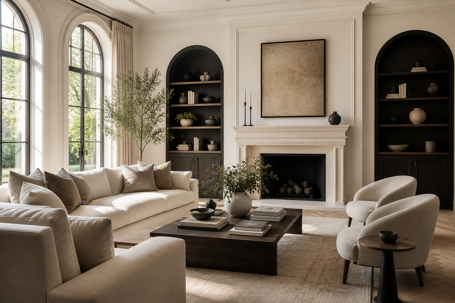
Quiet luxury begins with decisions most people never notice.
If you’re building, remodeling, or simply studying homes, these are the layout choices that consistently separate thoughtful design from plans that only look good on paper.
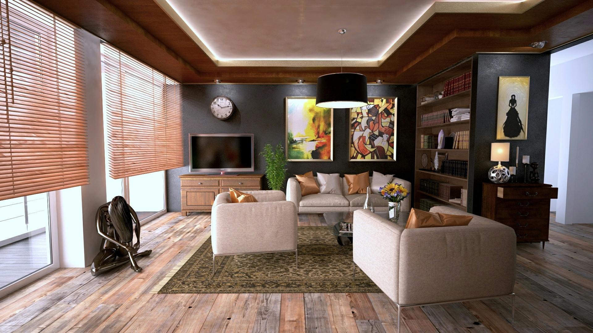
Long hallways and oversized transitions are often mistaken for luxury.
In reality, they’re usually just expensive walking space.
A well-designed home minimizes wasted circulation while still allowing rooms to breathe. The goal isn’t to eliminate hallways entirely — it’s to make movement feel intentional.
If a hallway must exist, give it purpose — a framed view, natural light, or a visual destination that makes walking through the home feel graceful instead of functional.
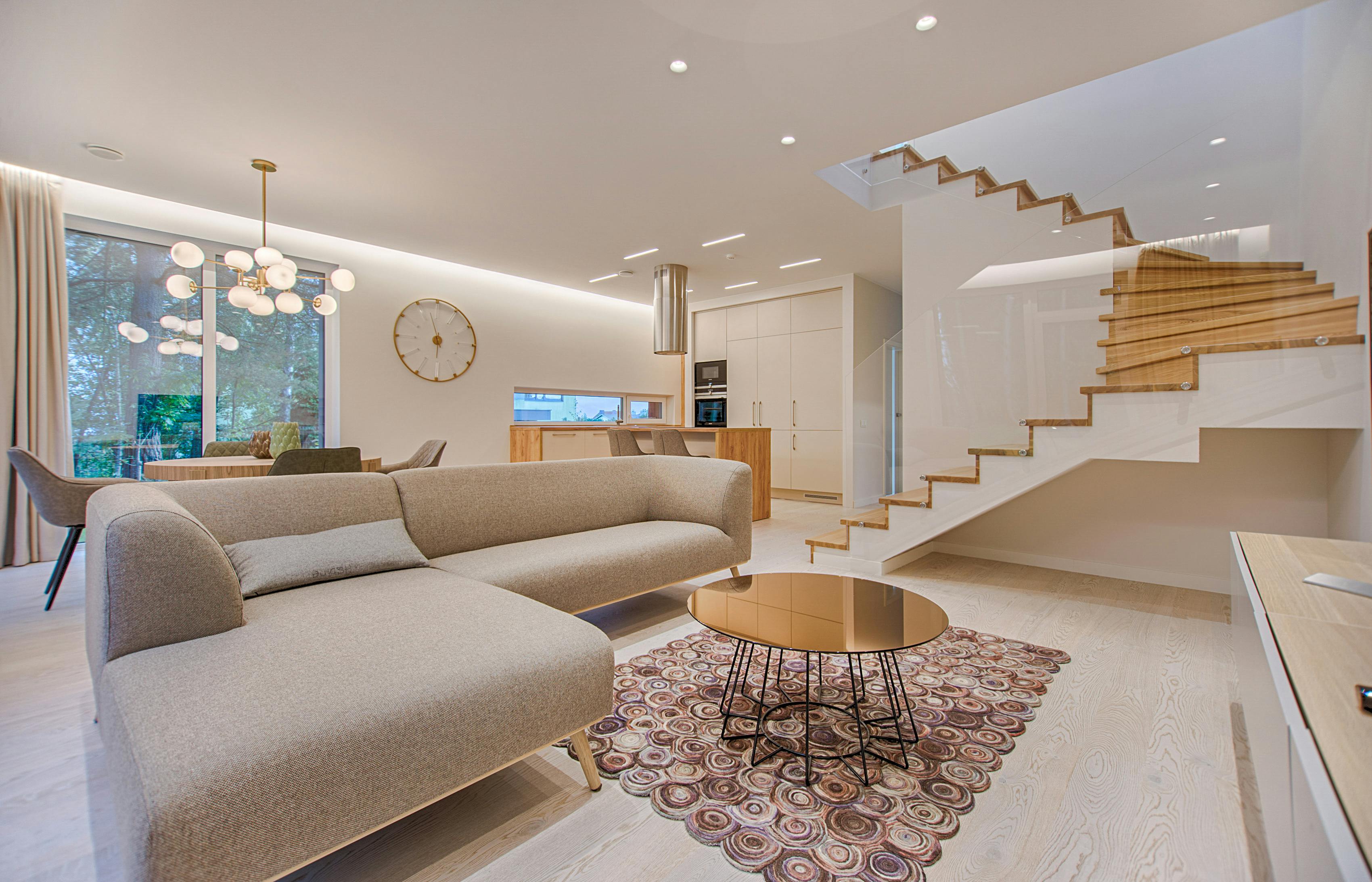
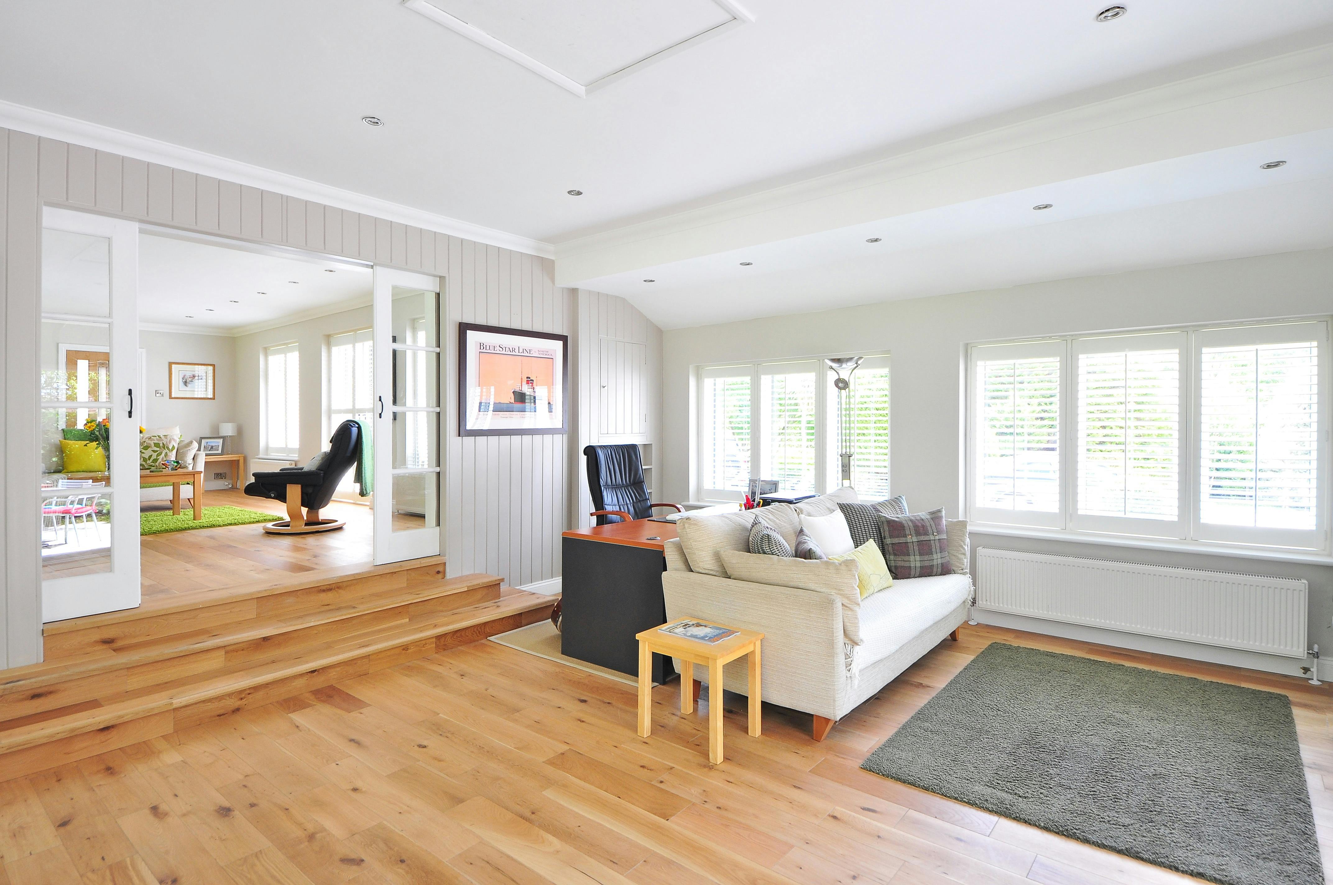
One of the most overlooked design mistakes happens the moment someone enters a home.
If the first view includes clutter zones, utility areas, or awkward angles, the entire house feels unsettled — even when the finishes are beautiful.
Well-designed homes almost always control what you see first.
Use subtle turns, partial walls, or intentional furniture placement to soften what’s revealed. The goal is visual ease, not drama.
This is one of the strongest signals of thoughtful design — and one that many plans quietly miss.
Primary spaces often receive the best views, proportions, and attention, while children’s rooms or secondary bedrooms become afterthoughts.
But homes built for real life don’t age well when only a few spaces feel important.
Give every bedroom at least one intentional design advantage — a view, ceiling detail, or balanced layout. Luxury isn’t hierarchy. It’s consistency.
The most peaceful homes aren’t necessarily cleaner — they’re better at containing function.
Laundry, storage, exercise equipment, bulk supplies, and everyday overflow need somewhere to live so the main spaces can remain visually quiet.
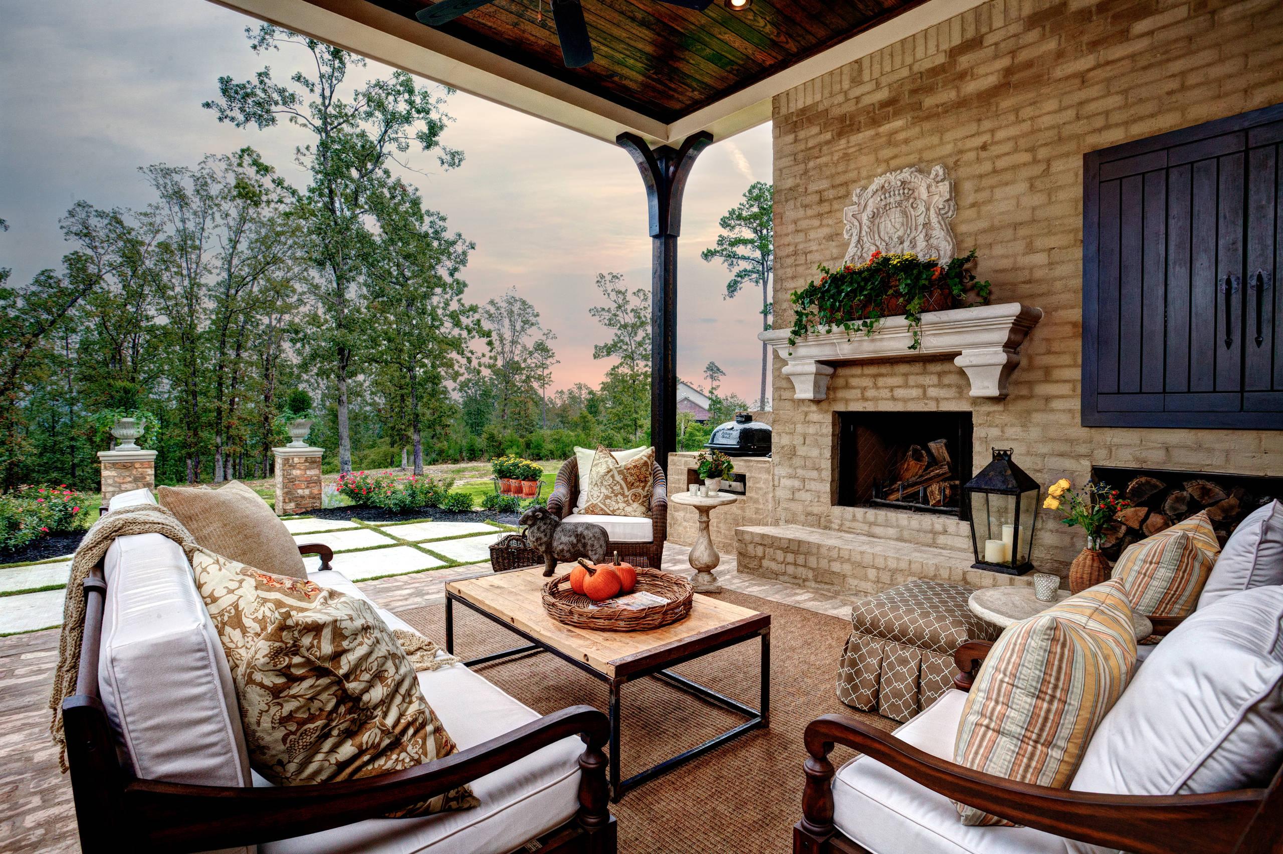
A dedicated utility or community space can elevate the entire home by protecting the aesthetic zones. Hidden function is one of the clearest signals of quiet luxury.
A common layout mistake is reserving the best windows and outdoor access for a single “important” space.
Homes feel more gracious when light is shared.
Secondary bedrooms, hallways, laundry spaces, and connecting zones all benefit from thoughtful access to daylight and outdoor views.
Consider shared outdoor connectors — screened porches, breezeways, or community patios — that unify the home instead of dividing it into status zones.
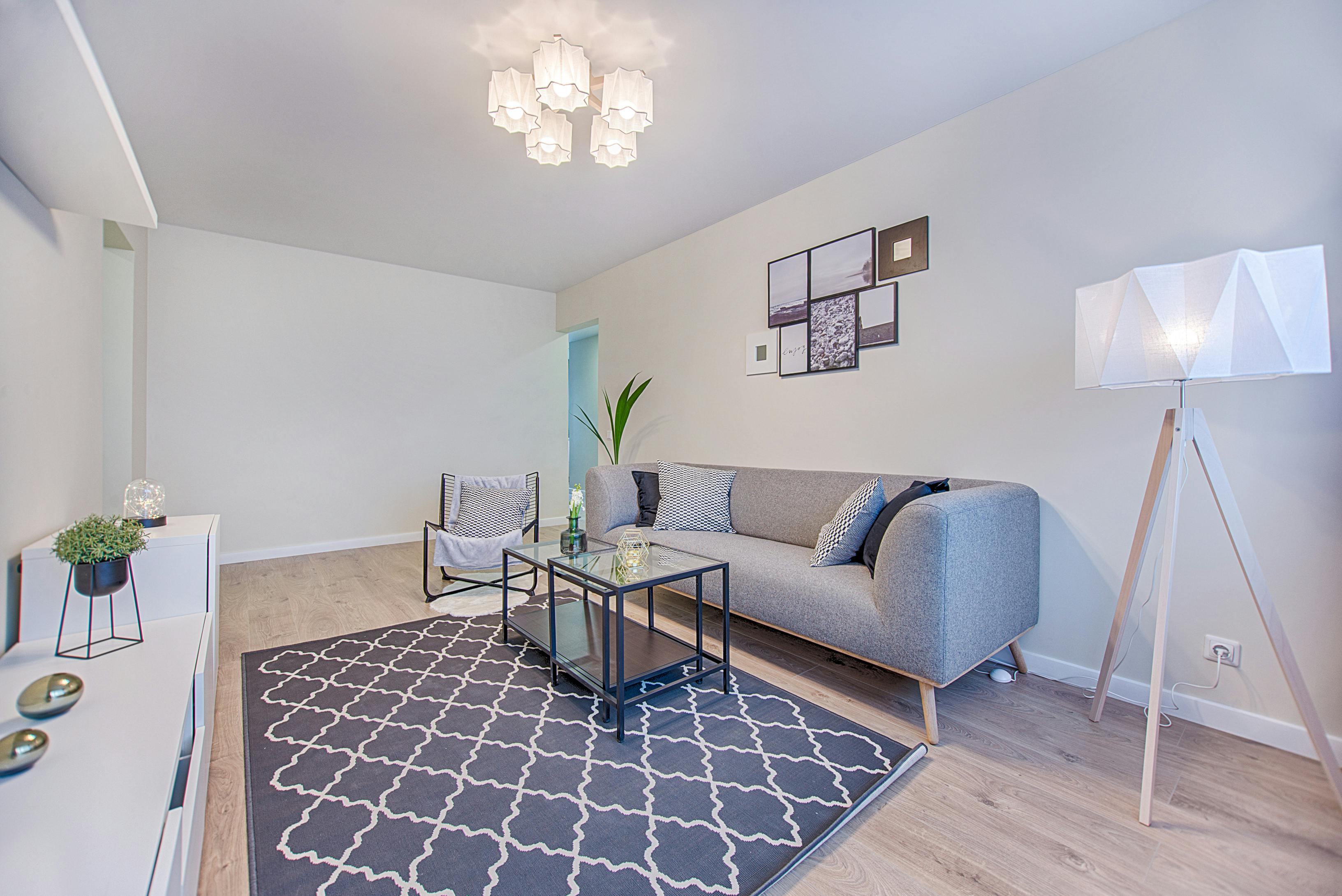
The homes that feel restful usually made these decisions long before décor entered the conversation.
Lighting zones, outlet placement, and furniture planning quietly shape how a space feels every day.
Think about symmetry, photography, and visual calm during planning. A clean wall or thoughtful lighting zone often contributes more to a refined feeling than any decorative upgrade.
If those answers feel clear, the design is usually strong.
The homes that leave the deepest impression rarely announce themselves loudly.
They simply feel settled — balanced, intuitive, and quietly confident.
And that’s the lens I’ll keep using throughout this build series: not chasing trends or oversized spaces, but studying the design decisions that make a home feel right long before the styling begins.
What layout decision do you think makes the biggest difference in how a home feels day to day?